It’s not often that Honda reveals a new logo. In fact, it’s been about 43 years since we’ve seen a redesign of the familiar “H mark” that Honda so lovingly calls it. That changes today at the 2024 CES where Honda debuted a new H mark that is destined for future electric vehicles.
Do note the EV caveat there, too. Honda specifies that this logo will be coming to the “next-generation EVs of Honda,” which suggests the gasoline-powered vehicles in its current-day lineup won’t bear the new logo. They’ll presumably carry forward with the current logo, and while said mark has technically been the same since 1981, a light update at the turn of the millennium has kept it feeling relatively fresh.
Funnily enough, this new Honda logo is more reminiscent of the original H mark that was used throughout the 1960s (seen for comparison below, left) than of any other Honda logo. It looks like a revamp of that old-style look, giving it a retro vibe while maintaining a fresh and modern appearance.
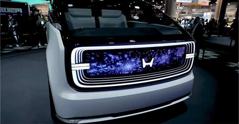
Honda says that it’s designed a new logo now to “commemorate the development of the next-generation EVs.” It only makes sense that the logo is revealed alongside two new electric concepts at CES named the Saloon and the Space-Hub. You can see the logo in action for the first time on both of those models in our reveal post here.
Honda Reveals New Logo For Future Electric Vehicles
This morning at the 2024 Consumer Electronics Show (CES), Honda as offered the public a glimpse into its future as an all-electric brand, unveiling two EV concepts as part of its new “0 Series” of passenger vehicles that will be sold globally. That will begin with a bespoke Honda model evolving from the Saloon concept you can see below.
2024 is a new year and a blank slate for all of us, including legacy OEMs like Honda, trying to pave their way into a growing BEV market worldwide.
While Honda had previously held a position on one side of the street with its fellow Japanese automakers like Toyota, viewing an all-electric future of mobility with skepticism and reluctance, the 75-year-old automaker has had a change of heart. It is going electric – but now it has to play catchup.
Honda now has several EVs in the pipeline, including the upcoming Prologue SUV built atop GM’s Ultium platform. The Japanese automaker also announced collaborations with other OEMs in 2023 to establish local charging networks.
The New H Means,
The letter ‘H’ represents the company name and the name of its founder, Soichiro Honda. That is why the company never fully replaced the letter. It now symbolizes the company’s values and message in the global market.
While the company returned its old retro ‘H’ logo this time, some crucial changes were also made. The new design changes in the Honda new logo convey Honda’s ambition to enter the electric vehicle market and send the right signals to the customers.
Here are the noticeable changes made to the conventional ‘H’ logo. It’s a flatter ‘H’ design
The previous custom logo design had a stylized shape of the H for the company’s regular vehicle business. But now the electric vehicle business has a new logo with the old ‘H’ letter brought back.
The Change Took Us Away
Previously, the H logo had a skeuomorphic metallic look. But the new H design is a flatter and simpler version of the earlier symbol. It also looks impressive as a Honda emblem light up at the vehicle’s rear end against the lighted background.
The logo now looks much more sophisticated due to its minimalist design. It does not require the support of any other element to look impressive. That is a minimalist logo’s key characteristic, such as a Volvo emblem.
The new logo conveys freedom from pollution by freeing the symbol from the boundary lines. It also symbolizes the ease and joy of driving an electric vehicle. The letter shape changed a bit.
The ‘H’ shape looks narrower at the bottom and broader at the top, giving it a unique shape. This formed a distinctive wedge shape. But the broader look at the top also shapes it up as a gesture of someone raising arms towards the sky. The Honda emblem can symbolize the help or solution the company provides to its customers through modern vehicles.
An Overview of the New H
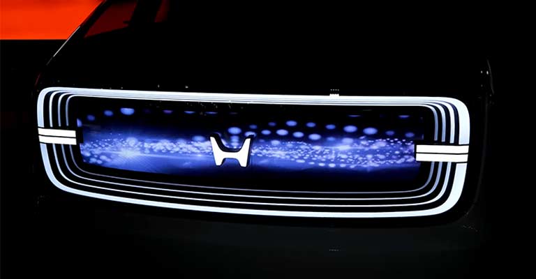
Another noticeable change in the logo design is regarding the boundary line. The earlier H mark had a tight border surrounding it. Now, the new H design has sharper upper prongs stretching outward. So, they give the impression of a pair of ‘outstretched hands.
We just saw Honda pull the plug on production of its “e” minicar in Europe while also nixing plans to build additional affordable EVs with GM. These recent moves have begun paving the way for Honda’s future lineup of all-electric vehicles, several of which have already been teased.
This morning in Las Vegas, we learned that Honda’s new lineup of EVs will get their own unique “H” badge (seen below), and part of this welcome electrification strategy includes a new series called “0.” The automaker shared that the 0 Series is based on three core principles: Thin, Light, and Wise.
Sounds a lot like my 2024 resolutions. Honda kicked off the public debut of the 0 Series with two concept EVs, one of which will inspire the new line’s first production model.
Honda doesn’t provide a great deal of explanation for the logo’s design, but here’s what it does say: “This design expression, like two outstretched hands, represents Honda’s commitment to augment the possibilities of mobility and sincerely serve the needs of the users of Honda EVs.”
The biggest hurdle to jump over for those familiar and comfortable with the current logo is perhaps the lack of an outline around the logo that we’ve associated with the H mark for decades now. Outline or not, though, we’re fans of this new design direction and are excited to see the vehicles that Honda puts out with a fresh look.
It Comes with Two EV Concepts
In front of a crowd at CES 2024 this morning, Honda unveiled the two EV concepts developed under a “new Honda electrification design and engineering approach.” The vehicles seen below are called “Saloon” and “Space-Hub” and arrive as the precursor to Honda’s next-generation 0 Series EVs. Per Honda Global EVP Shinji Aoyama:
“We have gone back to basics and formulated the Honda 0 Series with a design for the new era. A bold and pure proportion that from the first glance is overwhelmingly different from other EVs to evoke a new perspective for people.”
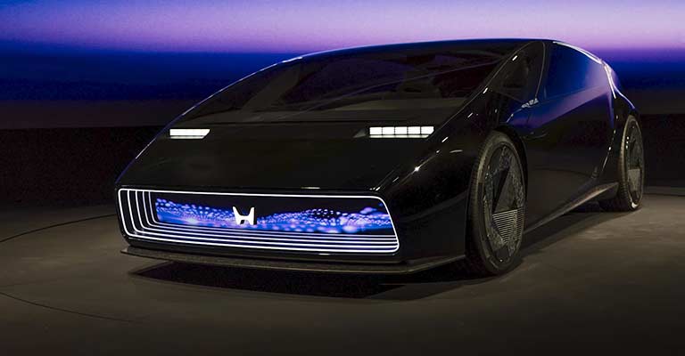
Let’s start with the Saloon. Honda is calling this EV its flagship concept for the 0 Series. It sits atop the automaker’s dedicated platform while showcasing its “man maximum/machine minimum (M/M) design language in which it is low, wide, and spacious.
Other features include steer-by-wire and motion control management systems, as well as robotic posture control that adjusts the driver throughout various driving situations so they can “realize the ‘joy of driving’ in the EV era.”
Honda says its first passenger EV in the 0 Series will be based on this Saloon concept and is expected to hit the North American market in 2026.
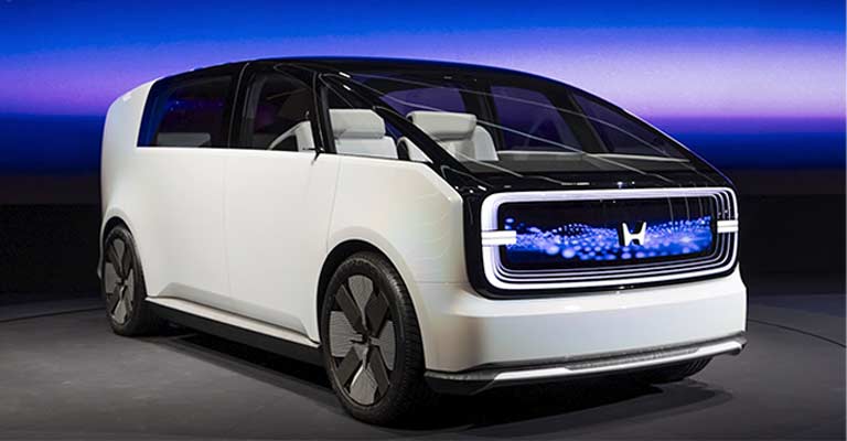
Honda’s second EV concept, making its global debut in Vegas this morning, is a much larger EV with an interesting caboose called the Space-Hub. Honda was lighter on details of this one but said it was developing under the idea of “augmenting people’s daily lives.”
As such, the Space-Hub offers a roomy interior, seating for several passengers and an airy panoramic glass roof.
So far, there has been no mention from Honda about developing Space-Hub concept into a production EV just yet. That could change as we near 2026 when Honda’s 0 Series is set to launch in North America alongside additional EV models in markets like Japan, Asia, Europe, Africa and the Middle East and South America.
Summary
With its new logo design, Honda has joined the race of car manufacturers, shifting their focus from conventional petrol-diesel vehicles to new electric ones. Some major global vehicle manufacturers have sensed the shift and are going wholeheartedly electric. Honda is one such global giant that has recently announced launching its electric vehicles.
When companies add new products or services to their businesses, they often refresh or redesign their logos. This is because a logo is always the most seen visual of any brand. So, when people encounter a logo, they get a clue of what the business is all about or what new it is about to offer.
This is also true for the new changes the global brand Honda made to its logo recently. The company has plans to foray into the growing electronic vehicles market in a big way. So, it tweaked its old logo to align it with its new brand message.

